
Skate Cabal Ltd
Industry
Sports & Recreation
Community & Lifestyle
Events & Culture
Youth Development / Social Impact
Deliverables
Brand Strategy
Brand Identity Design
Creative Direction
Website Design
Skate Cabal is a multi-award-winning community and lifestyle roller skating movement based in London. Born from listening to skaters and responding with action, it creates safe, inclusive spaces where people of all ages and backgrounds can move, connect and express themselves. Through coaching programmes, youth development, community events and culture-led merch, it brings people together through movement, wellbeing and joy — building more than skaters, but a connected community on wheels.


The Challenge
When Skate Cabal's founder James reached out, his business had grown significantly through programmes, partnerships and community, but the brand and website hadn't grown at the same pace. He wanted a stronger, more cohesive identity that better reflected who they are today, and a foundation that could work across community events, partnerships and future opportunities.
The Strategy
Before jumping into visuals, we dug into the why. Who is Skate Cabal really for, and what makes them different? Research showed competitors in their space had little brand presence, or gave off "charity vibes" — so the opening was to position them not as a community organisation, but as a cultural lifestyle movement people want to belong to.
The Identity
The Skate Cabal logo was redesigned to capture the essence of forward motion — the rhythm, speed and flow of roller skating. A sporty type style was chosen to embody that momentum, while subtle Y2K influences echo the nostalgic skater culture at the heart of the brand.
The connected wordmark reinforces unity, drawing from the meaning of "Cabal" as a collective. A supporting stroke device surrounds the lettering — visually holding it together — symbolising the belonging, shared energy and community that defines Skate Cabal.





The System
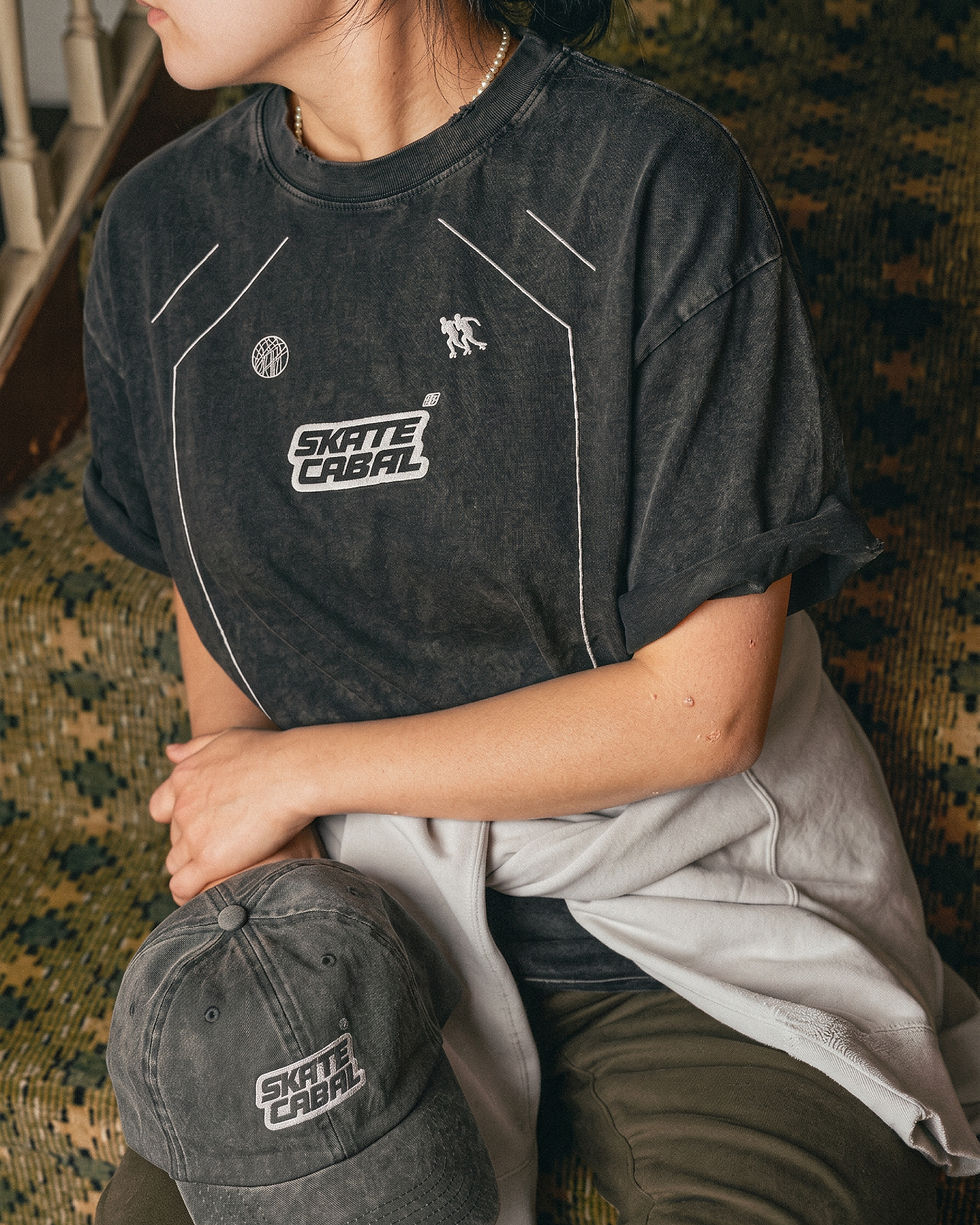
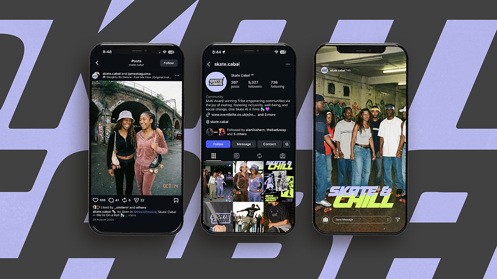
What I've created is bold italic sans-serif lettering that reflects speed, connected forms that symbolise community in motion, and graphics inspired by skate skid marks that capture movement, freedom and lived experience. The Y2K-inspired palette expresses joyful rebellion while staying true to the brand's core values, with their purple kept in the mix. The photoshoot I creative-directed captures its attitude — joyful, confident, fearless, community-led — and the refreshed website says exactly what they do, makes booking effortless, and finally feels like the brand they've become.
Results
-
Brought confidence to how the brand presents itself and tells its story
-
Made the brand more cohesive and more intentional
-
Sharpened messaging and improved consistency across every touchpoint
-
Positioned the business for its next chapter and future opportunities
"Working with Anya at Studio Bess has been a great experience. She really took the time to understand Skate Cabal, our community and the bigger vision behind what we're building, and translated that into a brand that feels authentic to us while giving us room to grow. I've come away from the process with much more clarity and confidence in how we present Skate Cabal to the world."
Founder; James Kaguima


more projects

Strategy | Brand Identity | Website | Socials | Adverts
DICE CIC

Strategy | Brand Identity | Packaging
MOTTO

London → Worldwide