
Motto
Industry
Food & Beverage
Condiments & Sauces
Consumer Packaged Goods
Deliverables
Brand Strategy
Brand Identity Design
Packaging Design
Social Media Collateral
Motto is a Japanese-inspired wasabi hot sauce brand, created to introduce young adults and university students to the rich, vibrant culture of Japan. The goal is to encourage them to bring spice into their diets and take advantage of the health benefits that come with it, like better digestion.


The Challenge
Motto stands for "more" in Japanese, stemming from the word "moreish". The brief was an identity for young adults, rooted in and inspired by Japanese culture — one that felt exciting, and deliciously affordable.
The Strategy
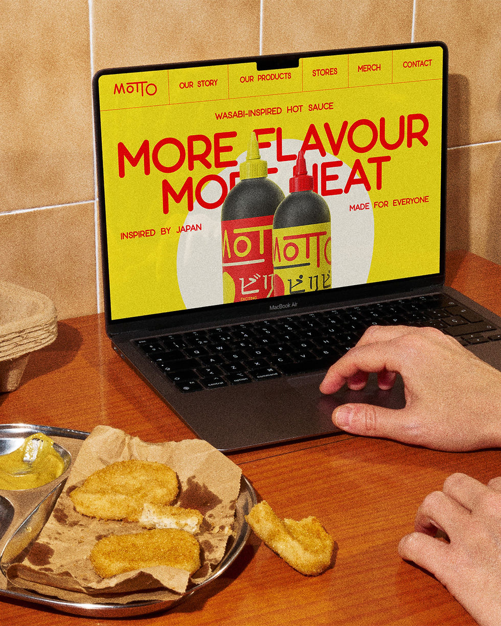
Motto's strength is its bold, striking identity, so I made that the key element: enticing young people to buy into Japanese culture, while keeping it appealing to an audience new to it.
The Identity
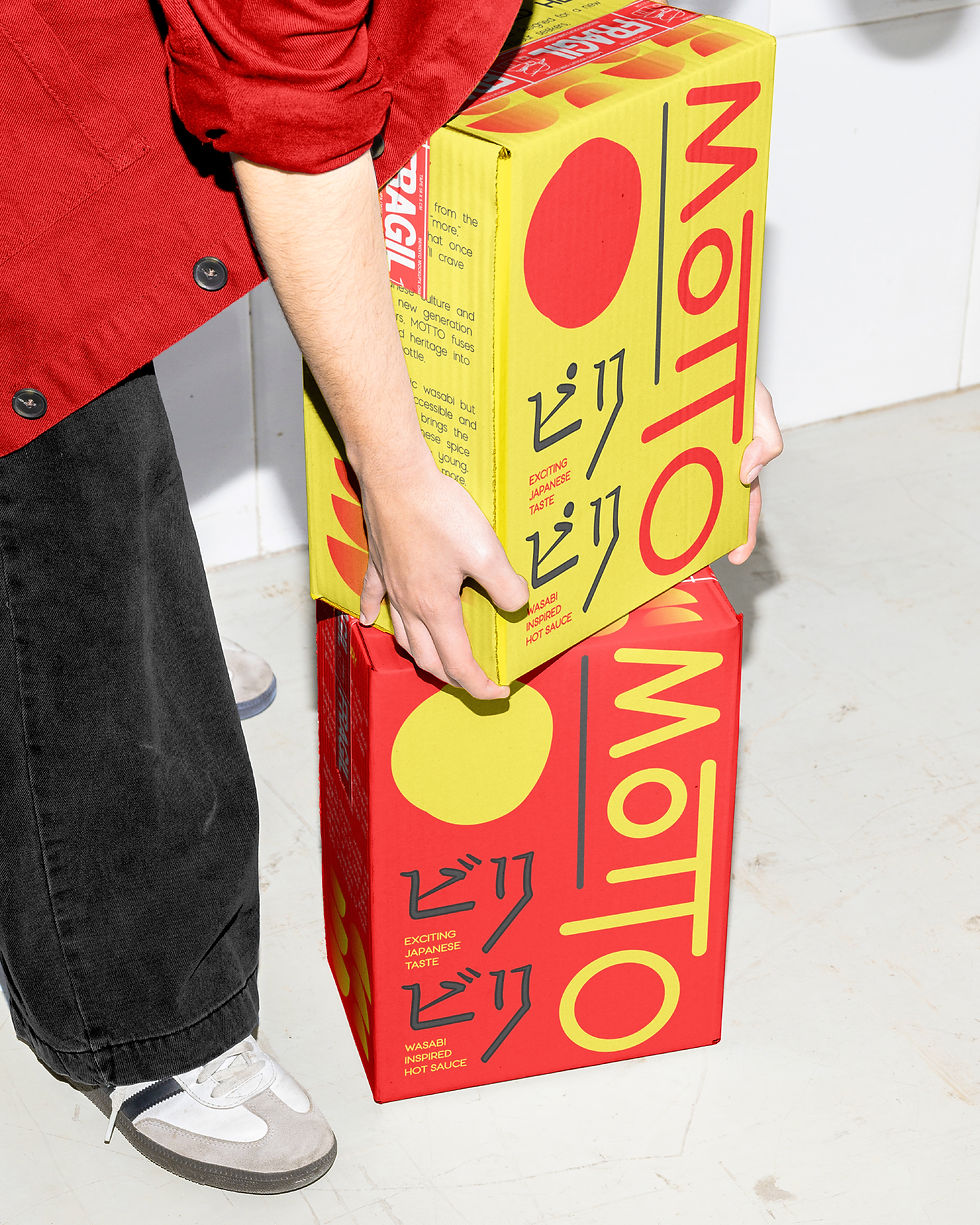
Inspired by the simplicity of Japanese design, I created something clean and straightforward that let the bold colours do the heavy lifting. I created a hand-drawn icon that represented the brand, inspired by the Japanese flag — but instead of making the circle perfectly round, the hand-drawn flair adds more personality and character.
The System
Clean, minimalist typography, bold and striking colours that induce flavour and excitement, and photography that's coloured and textured highlighting Japanese culture. Including hand-drawn calligraphy and the hand-drawn icon.





more projects
Strategy | Brand Identity
The indastree

Strategy | Brand Identity | Website
SKATE CABAL

Strategy | Brand Identity | Website | Socials | Adverts
DICE CIC

London → Worldwide